Imagine walking into a room that exudes calm, sophistication, and timeless elegance—welcome to the world of agreeable gray coordinating colors! This versatile hue has become a favorite among homeowners and designers alike because of its ability to complement nearly any color scheme, creating a harmonious and inviting atmosphere.
In this article, you’ll discover a variety of inspiring color combinations that pair beautifully with agreeable gray, offering you endless ideas to refresh your space. Whether you’re aiming for a soft, subtle look or a bold, striking contrast, these ideas will help you craft a stylish and cohesive home that stands the test of time.
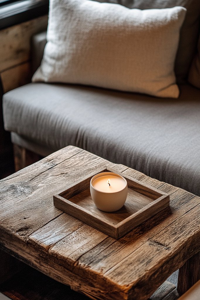
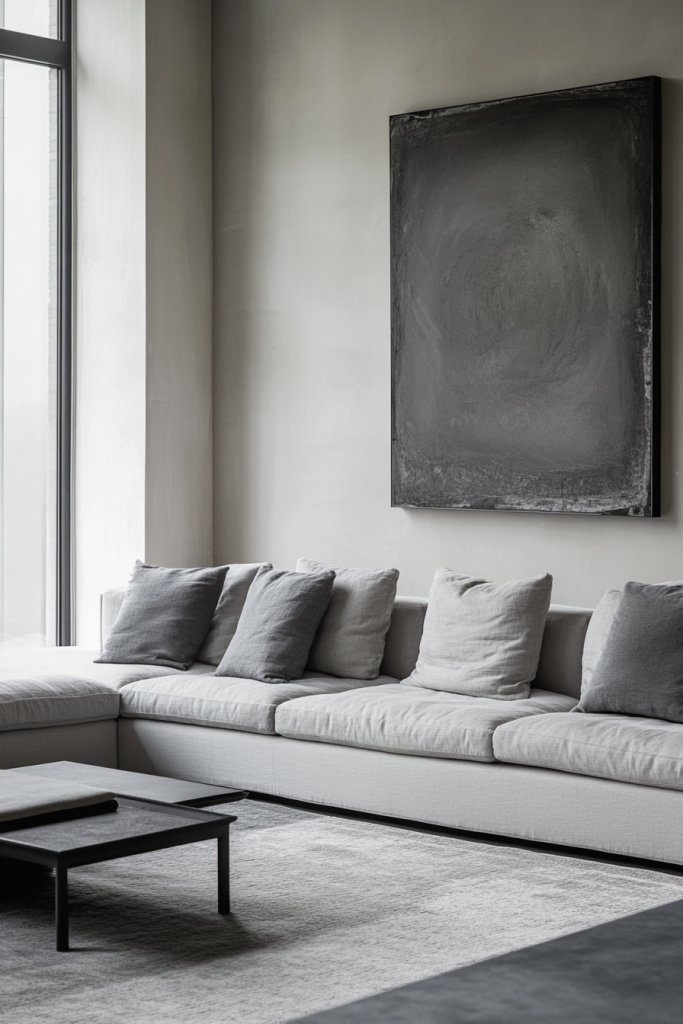
1. Charcoal Black for Modern Depth and Sophistication
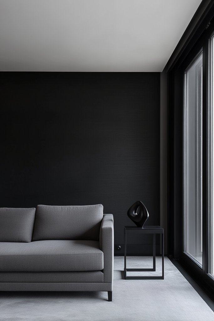
Feeling like your gray space needs a little more edge? Charcoal black can add instant depth and a sleek, modern vibe. It’s perfect for those who love a minimalist aesthetic but want their space to feel rich and layered. Black accents provide contrast that’s both dramatic and sophisticated. Who says gray and black can’t be the perfect power couple?
Imagine matte black picture frames, black metal fixtures, and a dark charcoal accent wall. Textured black ceramics or matte black hardware on cabinets add subtle yet impactful details. Soft lighting reflects off black metal and textured surfaces, creating a moody yet elegant environment. The contrast with light gray walls makes every detail pop, giving your space a bold, contemporary feel. Think sleek, industrial, or modern luxe styles.
Black works well in modern and industrial spaces, especially when paired with metal and concrete. Use it sparingly in small accents like lamps or hardware to avoid overwhelming the room. For a cozy touch, incorporate black in textiles like cushions or throws with textured fabrics. During winter, add black accessories in plush velvets or faux fur for warmth. In smaller spaces, use black in small doses to create focal points or highlight architectural features.
Begin with a black accent wall or large furniture piece in charcoal or black matte finish. Mix in black fixtures and hardware for a cohesive look. Use textured black ceramics or matte accessories to add tactile interest. Complement with lighter neutrals to prevent the space from feeling too dark, and incorporate metallics for a luxe touch. Balance the dark hues with well-placed lighting—think sconces or LED strips—to highlight textures and details. Keep surfaces matte or textured for visual depth.
Personalize with black trim, shelving, or decorative objects that have sculptural appeal. Combine black with warm woods or metallic accents to soften the look. Experiment with black-and-white patterned textiles in cushions or rugs for visual intrigue. Use matte black hardware on furniture or cabinetry for a seamless, modern finish. These touches elevate your space into a sleek, contemporary retreat.
Charcoal black is a bold choice that adds confidence and sophistication to any gray scheme. It’s versatile enough to work in various styles, from industrial to modern luxe. Play with textures, finishes, and metallic accents to keep the look fresh and dynamic. Embrace the drama and let your space stand out with confidence.
2. Soft Mint Green for Fresh, Restorative Vibes
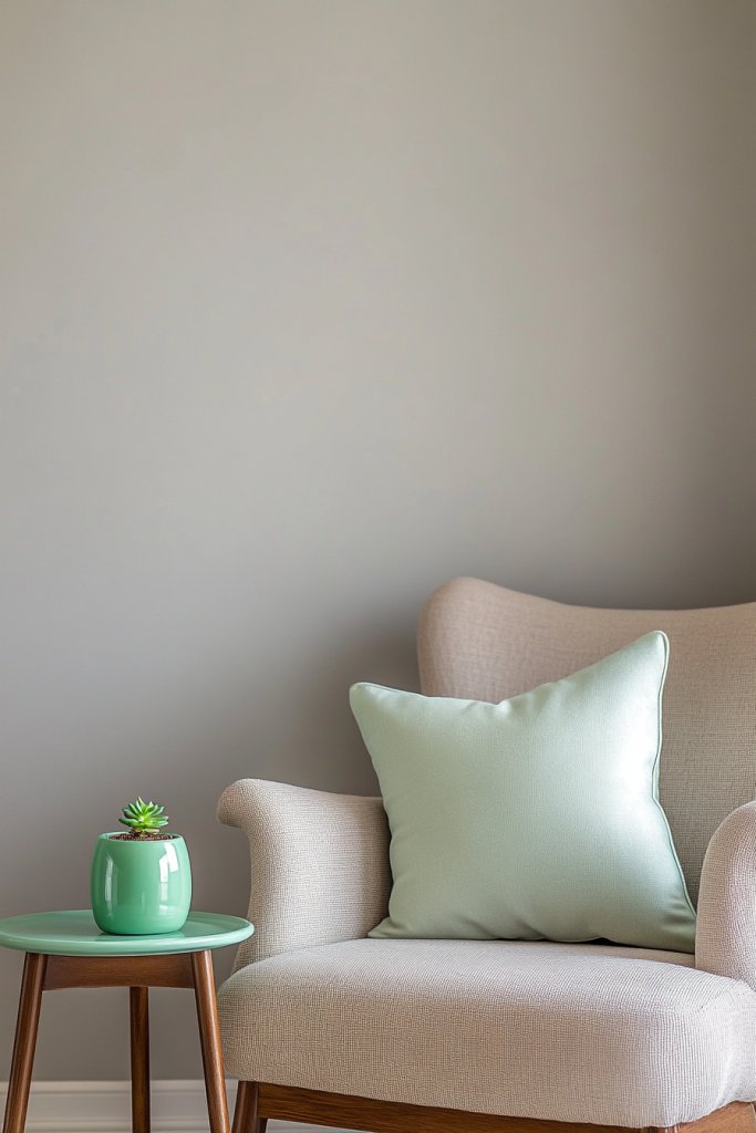
Want your gray space to feel more lively and refreshing? Soft mint green offers a calming, restorative vibe that energizes without overwhelming. It’s a perfect choice for those who love a touch of nature-inspired color but prefer a subtle, sophisticated tone. This hue can transform your space into a breezy, serene retreat. Who wouldn’t want their home to feel like a breath of fresh air?
Picture a plush mint green throw pillow on a gray linen sofa, with hints of mint in small decorative ceramics or textiles. Imagine mint-colored accents on curtains or upholstery that brighten the room. Soft mint walls or painted furniture pieces create a soothing backdrop, while white or light wood details keep it airy. The overall effect is fresh, clean, and inviting—a perfect harmony of cool tones and neutral grays. Think of a gentle sea breeze captured in decor.
Mint green works well in coastal, Scandinavian, or modern interiors. During summer, pair it with crisp whites and sandy neutrals for a beachy vibe. In colder months, combine with warm beige or taupe for a cozy feel. Use mint in small accents for subtle freshness or in larger pieces for a bold statement. For small spaces, mint accessories or accent furniture can lift the entire room’s mood.
Start with mint textiles—cushions, throws, or curtains—paired with your existing gray furniture. Incorporate mint through paint or wallpaper on an accent wall for a focal point. Use natural materials like light wood or wicker to enhance the fresh vibe. Balance the color with neutral tones and metallic details to add sophistication. Keep the palette light and airy, avoiding clutter to maximize the calming effect. Consider using mint in accessories like trays or small decorative objects to keep the look cohesive.
Create a personalized space by mixing different shades of mint with soft pastels or bold accents. Add textured textiles like ribbed or quilted fabrics for visual interest. Incorporate metallics such as silver or brushed nickel to add a contemporary touch. Use decorative ceramics or sculptural pieces in mint for a curated look. These details help make the space uniquely yours, full of fresh personality.
Mint green offers a refreshing alternative to traditional neutrals, giving your space an energetic yet calming feel. It pairs beautifully with both warm and cool tones, making it highly versatile. Confidently experiment with textures and shades to craft a space that feels vibrant and peaceful at once. It’s a timeless choice for creating a restorative, vibrant environment.
3. Warm Mustard Yellow for Cheerful Accents
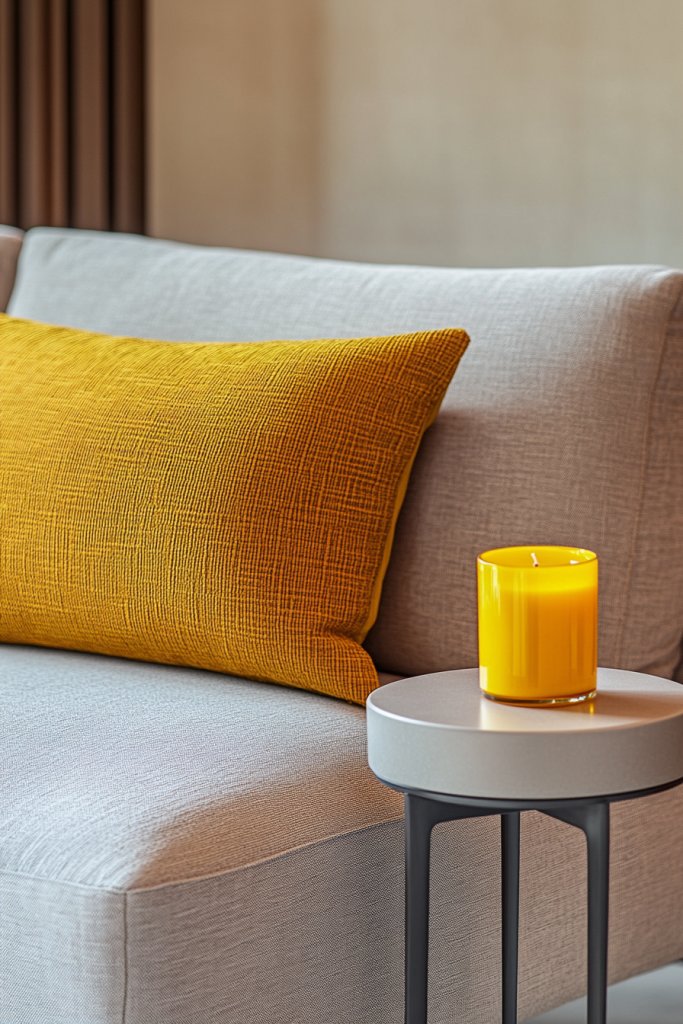
Looking to add a cheerful, optimistic touch to your gray decor? Mustard yellow is a warm, inviting hue that instantly lifts the mood. It’s perfect for those who want a pop of color without going overboard. This shade complements gray beautifully, creating a lively yet balanced space. Who wouldn’t want their home to feel sunny and welcoming?
Picture a cozy sofa adorned with mustard yellow cushions, paired with a textured throw in complementary tones. Imagine mustard accents in a bold rug or decorative pillows that add warmth to a neutral room. Think of a side table or lampshade in mustard yellow that catches the eye. The overall look is vibrant but sophisticated, with the richness of the hue balancing the coolness of gray.
Mustard yellow works well in both modern and vintage-inspired interiors. Use it in textiles, ceramics, or small furniture pieces for a cheerful burst. During spring and summer, pair it with crisp whites and soft neutrals. In fall and winter, combine with deep browns or rust tones for a cozy effect. For small rooms, add mustard in accessories or accent pieces to brighten the space without overwhelming.
Start by choosing mustard yellow in cushions, throws, or accent furniture. Mix textures such as velvet, linen, or woven fabrics to add depth. Incorporate it through a bold rug or curtains that serve as focal points. Balance with neutral walls and furniture, and add metallic or wooden accents for sophistication. Play with patterns and layering to keep the look lively and dynamic. Keep the overall palette warm and inviting.
Personalize with embroidered details or hand-painted ceramics in mustard yellow. Layer different shades for added depth—think ochre, amber, or pumpkin. Add metallic details like gold or brass to elevate the look. Use textured fabrics or decorative trims to make textiles more interesting. These small personal touches turn a simple accent into a signature style.
Mustard yellow accents bring joy, warmth, and confidence to your space. It’s a versatile hue that complements many styles, from boho to modern minimalism. Confidently layer textures and mix shades to craft a space bursting with personality. Embrace this cheerful color for a lively, inviting home.
4. Crisp White for Bright, Airy Environments
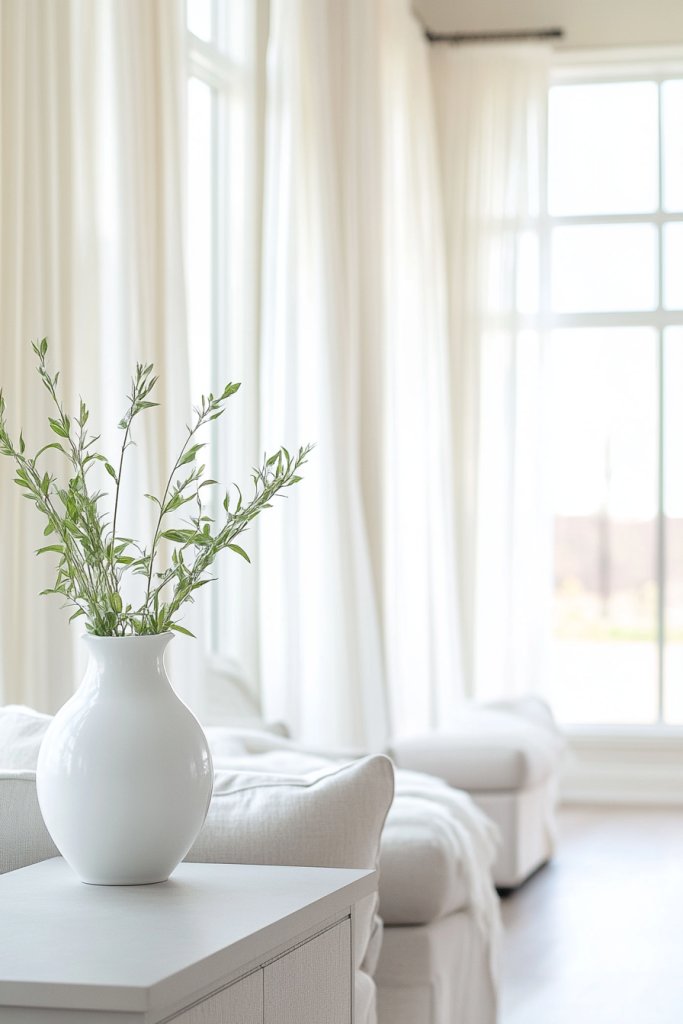
Do gray walls sometimes feel dull or heavy? Crisp white accents can instantly brighten and refresh your space. White creates a clean, airy backdrop that makes everything feel more spacious. It’s perfect for those who love a minimalist, modern aesthetic or want to maximize natural light. Who doesn’t want a room that feels fresh and open?
Visualize white trim framing large gray walls, with white bedding or furniture adding to the lightness. Think of a white coffee table with sleek lines, or a set of white shelves highlighting your decor. Bright white curtains or drapes diffuse sunlight beautifully, amplifying the sense of space. The contrast with gray adds crispness and clarity, making the room feel instantly more open and organized.
Use white in modern, Scandinavian, or coastal styles for a fresh look. During summer, pair with light linens and airy fabrics. In winter, layer with textured textiles like wool or thick knits in white. For small spaces, white walls and furniture create an illusion of size, while in large rooms, white helps break up visual weight. Mix with metallics or natural textures to add depth and interest.
Start with white walls or furniture as your base. Incorporate white through bedding, curtains, or accent furniture. Use white in decorative accessories like trays, picture frames, or storage bins. Balance the brightness with soft gray or natural wood tones. Experiment with different white shades—bright, eggshell, or matte—to get the perfect tone. Keep surfaces clean and clutter-free for a pristine look.
Add personal touches with textured white textiles—quilted cushions, waffle weaves, or embroidered details. Incorporate metallic accents in gold or chrome for a contemporary edge. Use white in decorative objects like sculptural ceramics or geometric lighting pieces. Play with layering different shades of white for a nuanced, sophisticated effect. These details help make your space feel fresh and uniquely yours.
Crisp white is a timeless choice that makes your space feel clean, bright, and inviting. It pairs effortlessly with any style or color palette. Confidently combine textures and metallics to keep the look fresh and modern. Your home will feel more spacious and energized in no time.
5. Rustic Wood Tones for Natural Warmth
Feeling that your gray space is a bit cold and impersonal? Adding rustic wood tones can instantly warm things up and bring a natural touch. Wood textures introduce an earthy, cozy vibe that’s both timeless and inviting. It’s perfect for those craving a connection to nature while maintaining a sophisticated look. Who wouldn’t want their home to feel grounded and warm?
Imagine a reclaimed wood coffee table paired with a plush gray sofa, complemented by woven jute rugs. Light oak or walnut furniture adds richness and depth, while wood-paneled walls create a warm backdrop. Think of open shelving with natural wood finishes displaying handcrafted ceramics or textiles. The interplay of textures—smooth upholstery versus rough wood—creates a layered, tactile environment perfect for relaxing.
Rustic wood is versatile across styles—from farmhouse and rustic to modern minimalism. Use darker woods for a more dramatic, cozy look or lighter woods for a bright, airy feel. Layer with textiles in natural fibers like linen, wool, or burlap. During winter, add chunky knit throws or woven baskets in wood tones. Even in small spaces, a wood accent piece can bring warmth without cluttering.
Start with wood furniture—tables, shelving, or accent pieces—in natural finishes. Incorporate wood through flooring, wall paneling, or decorative accessories. Mix different wood tones for visual interest but keep a cohesive style. Pair with neutral textiles and soft lighting to emphasize warmth. Maintain the wood’s natural finish or apply oil or stain for durability. Balance rustic elements with sleek modern pieces for a contemporary twist.
Personalize with handcrafted wooden items—cutlery, frames, or sculptures. Use contrasting finishes like matte black hardware or metal accents to add modern flair. Incorporate natural fibers like jute or sisal in rugs and cushions for added texture. Customize with painted or stained wood for a unique look. These touches make your home feel authentic and cozy.
Rustic wood tones create a warm, inviting environment that feels both timeless and personal. They connect your decor with nature, adding a sense of calm and stability. Confidently mix textures and finishes to craft a space that’s rich and layered. Your home will radiate comfort and style.
6. Soft Lavender or Mauve for Subtle Elegance
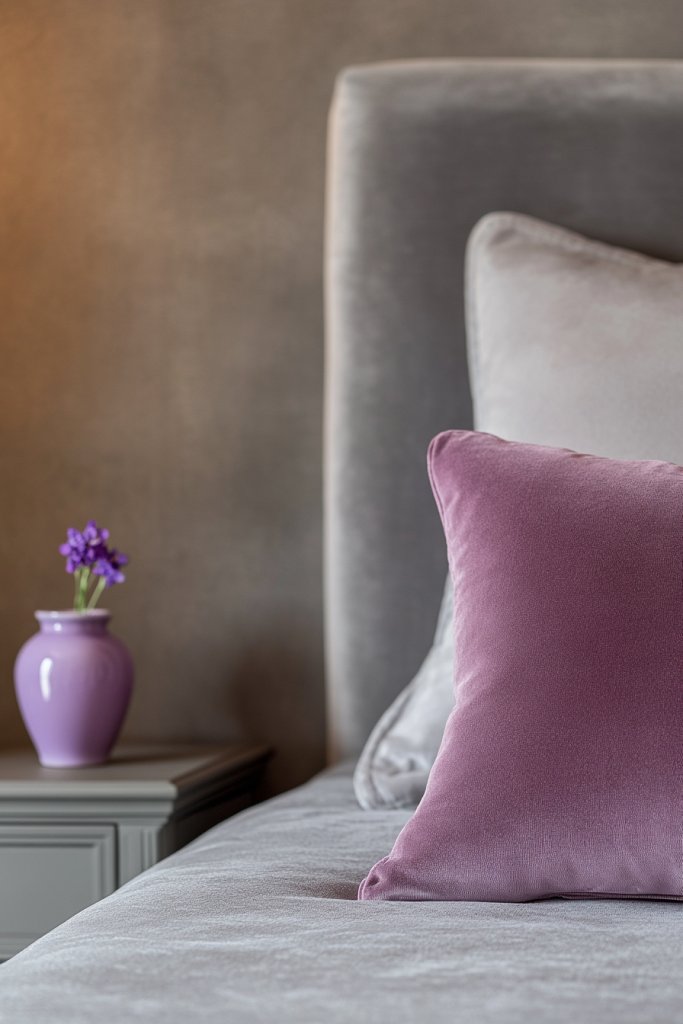
Want to add a delicate touch of femininity and sophistication to your gray palette? Soft lavender or mauve can do just that, infusing your space with subtle elegance. These gentle hues create a calming atmosphere that’s perfect for bedrooms or relaxing living areas. Who wouldn’t love a space that feels both refined and tranquil?
Picture lavender cushions on a gray upholstered bed, complemented by mauve curtains that softly diffuse natural light. Think of textured textiles like velvet or silk that catch the eye with their subtle sheen. Incorporate small decor pieces like ceramic vases or decorative bowls in lavender or mauve. The combination creates a sophisticated, feminine vibe that’s understated yet impactful. Imagine a space that whispers elegance.
Lavender and mauve are versatile across styles—from shabby chic and vintage to contemporary minimalism. Use them in textiles, wall paint, or accessories to add a soft pop of color. During spring, combine with pastel shades for a fresh look. In winter, deepen the hues slightly for a cozy, romantic feel. For small rooms, use these colors in small accents to avoid overwhelming the space.
Start with textiles—cushions, curtains, or throws—in lavender or mauve. Incorporate these hues via accent walls or furniture pieces with a gentle touch. Pair with neutral tones like gray, beige, or white to keep the look elegant. Use textured fabrics for added richness and depth. Balance softness with metallic accents like silver or brushed nickel for a modern touch. Layering different textures enhances sophistication.
Personalize with embroidered or printed textiles, or delicate ceramics to elevate the style. Mix in metallic or glass accents to add sparkle. Use mauve or lavender in art or decorative objects that reflect your personality. Incorporate vintage or handcrafted items for unique charm. These details help craft a space that’s both elegant and truly yours.
Lavender and mauve bring a whisper of elegance and calm to your home. They’re perfect for creating a peaceful, refined environment. Confidently explore different textures and finishes to craft a look that’s sophisticated yet inviting. Your space will radiate a subtle, timeless charm.
7. Metallic Silver or Chrome for Modern Shine
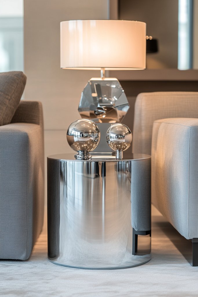
Looking to add a sleek, contemporary touch to your gray decor? Metallic silver or chrome accents can instantly elevate your space with a modern shine. These reflective surfaces introduce a sense of sophistication and brightness that’s hard to beat. Who doesn’t want their home to look chic and a little futuristic?
Picture shiny chrome fixtures on cabinets, sleek silver handles, and reflective metallic accessories. Think of a modern dining table with chrome legs or a set of silver decorative bowls catching the light. Incorporate metallic accents through lighting fixtures, picture frames, or small decor objects. The reflective surfaces add depth, bounce light around, and make the space feel lively and fresh.
Use metallic silver or chrome in minimalist, industrial, or modern decor styles. Combine with glass, polished concrete, or sleek surfaces for a cohesive look. During festive seasons, add metallic accents to elevate the decor. For small spaces, metallic details in hardware or fixtures can make a big impact without clutter. Pair with matte or textured neutrals to avoid overwhelming the senses.
Start with metallic hardware or fixtures—think faucets, cabinet handles, or light fixtures. Incorporate decorative objects like vases, sculptures, or trays in metallic finishes. Use reflective surfaces strategically to enhance natural light. Balance the shiny metal with matte or textured backgrounds for contrast. Regular polishing keeps the metallic shine looking fresh and new. Experiment with different finishes—brushed, polished, or matte—to find your vibe.
Add personal style with custom metallic art or sculptures. Mix metals—silver with gold or brass—to create a layered, curated look. Use metallic in unexpected ways, like on furniture legs or decorative hardware, for modern flair. Incorporate textured textiles or matte black elements to balance shiny surfaces. These personal touches make your decor feel intentional and unique.
Metallic silver and chrome are symbols of modern elegance and confidence. They reflect your bold style choices and elevate any gray scheme. Play with textures and finishes to keep the look fresh and vibrant. Confidence in mixing metals will give your space a polished, upscale vibe.
8. Olive Green for Earthy Serenity

Want your gray space to feel more grounded and peaceful? Olive green introduces an earthy, calming vibe that’s perfect for creating a serene environment. It’s a versatile color that pairs well with neutrals and natural textures. Who doesn’t crave a little more tranquility in their home?
Imagine olive green cushions on a gray linen sofa, with woven baskets and wooden accents around the room. Think of an olive green accent wall or a set of curtains that soften the space. Incorporate textured fabrics like burlap or linen, and natural materials like jute or sisal rugs. The overall effect is a peaceful, nature-inspired sanctuary that invites relaxation. Visualize a space that feels both fresh and timeless.
Olive green works in both contemporary and rustic styles, especially when paired with wood and stone elements. Use it in upholstery, curtains, or accessories for a subtle touch. During spring, combine with soft pastels or whites for a fresh look. For fall, deepen the shades with warm browns and rust tones. In small spaces, use olive in accessories or accent pieces to bring in a natural vibe without clutter.
Start with olive green in textiles—cushions, throws, or curtains. Incorporate it through furniture accents like a painted side table or a set of armchairs. Use natural wooden furniture and textured rugs to enhance the earthy feel. Balance the color with neutral walls and metallic or woven accents. Layer different shades of green for depth, and keep the palette natural and harmonious. It’s about creating a peaceful retreat.
Personalize with handcrafted or vintage pieces in olive green. Mix with other natural hues like taupe, beige, or rust for a layered look. Incorporate decorative ceramics, woven baskets, or textured textiles. Use metallic accents like brushed gold or bronze for a touch of sophistication. These details help craft a space that’s rooted in nature and personality.
Olive green offers a calming, earthy foundation that’s both versatile and timeless. It promotes a sense of serenity and connection to nature. Confidently explore layered textures and complementary hues to craft a balanced, tranquil space. Your home will radiate peaceful sophistication.
9. Pale Coral for Gentle Warmth and Playfulness
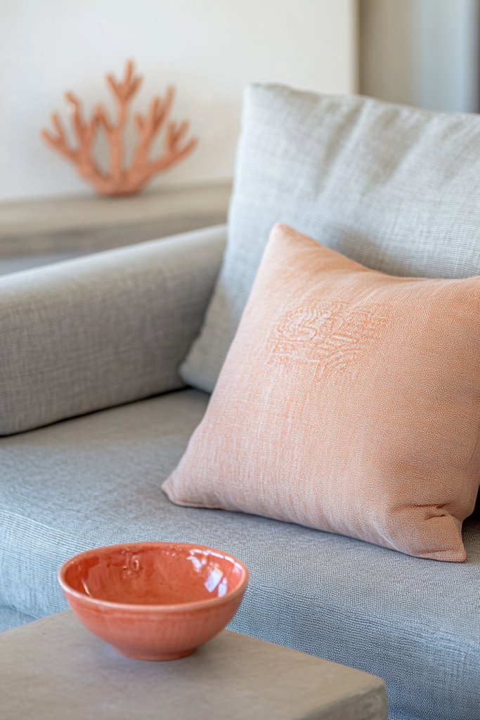
Looking to add a soft, warm touch that still feels playful? Pale coral can do wonders by bringing gentle warmth and a hint of fun to your gray scheme. It’s perfect for creating an inviting, lively atmosphere without overpowering. Who wouldn’t want a space that balances calm and cheerful energy?
Picture pale coral cushions on a gray velvet sofa, with coral accents in artwork or decorative objects. Think of coral-colored vases or lamps that add a pop of color in a subtle way. It pairs beautifully with soft neutrals, creating a harmonious and uplifting environment. Visualize a space that feels light, fresh, and welcoming—a perfect blend of playful and sophisticated.
Use pale coral in textiles, accessories, or accent walls for a subtle splash of color. It works well in coastal, boho, or modern styles. During spring and summer, combine with crisp whites and light woods. In fall, deepen the coral with terracotta or rust for warmth. In small spaces, use coral in small accents to create a lively vibe without clutter.
Start with coral textiles—cushions, throws, or curtains—to introduce warmth. Incorporate coral through small decor objects like picture frames or lamps. Balance the color with calming neutrals like gray, white, or beige. Use textured fabrics to add depth and interest. Play with layering different shades of coral and neutral tones for a lively yet balanced look. Keep the decor light and breezy.
Personalize with hand-painted ceramics, embroidered textiles, or custom art in coral shades. Mix in metallic accents like brushed gold or brass to add a touch of glamour. Use coral in unexpected ways, like painted furniture or decorative trims. Layering different shades and textures makes the space feel curated and personal. It’s about creating a cheerful, inviting environment.
Pale coral brings a joyful, warm energy that complements gray beautifully. It’s a versatile color that can be subtle or bold, depending on your style. Confidently experiment with layering textures and shades for a lively, inviting home. Your space will radiate personality and charm.
10. Deep Burgundy or Wine for Rich, Luxurious Touches
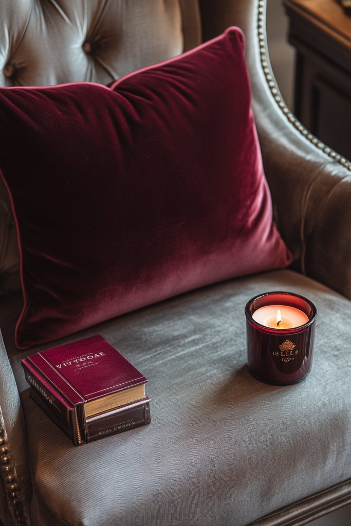
Want to add a sense of luxury and depth to your gray space? Deep burgundy or wine hues evoke richness and sophistication. These shades create a warm, intimate atmosphere that feels both timeless and opulent. Who doesn’t want their home to exude a sense of indulgence?
Imagine plush burgundy velvet cushions on a gray sofa, with a deep wine-colored drape framing a window. Think of rich-colored accent walls or decorative objects that add depth and drama. Metallic accents in gold or brass complement the deep hues, elevating the entire look. The contrast between the dark wine and soft gray creates a cozy, luxurious vibe. It’s like wrapping yourself in a warm, elegant embrace.
Use burgundy or wine in textiles, wall paint, or accent furniture for a regal look. It pairs beautifully with gold, brass, or natural wood. During winter, deepen the shades for a more dramatic, cozy feel. For smaller spaces, use it in pillows or accessories to add richness without overwhelming. In larger rooms, consider an accent wall or statement furniture piece.
Begin with textiles—velvet cushions, throws, or curtains—in deep burgundy or wine. Incorporate metallic elements like gold or brass in lighting, hardware, or decor objects. Use rich, textured fabrics to add tactile interest. Balance the dark hues with light neutrals and metallics for a luxe effect. Experiment with layered patterns and textures to add depth and sophistication. Keep lighting warm to enhance the richness.
Add personal touches with embroidered or hand-painted art in deep reds. Mix textures—velvet, silk, or brocade—to create visual richness. Incorporate vintage or ornate decorative objects for a truly luxurious feel. Use metallic accents to add sparkle and contrast. These details help craft a space that’s both elegant and inviting, full of character.
Deep burgundy or wine accents transform your gray scheme into a luxurious retreat. They evoke warmth, richness, and confidence in your design choices. Play with textures and metallics to elevate the look further. Confidence in bold, dark hues makes your space feel sophisticated and timeless.
11. Light Aqua or Turquoise for Refreshing Coolness
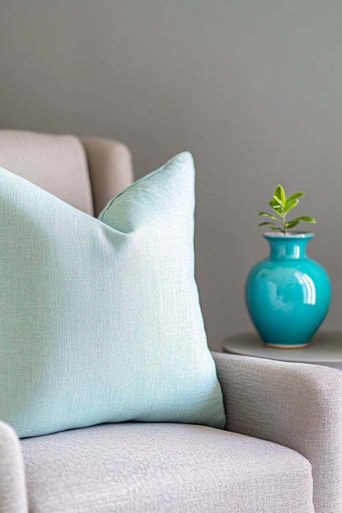
Craving a fresh, cool vibe in your gray interiors? Light aqua or turquoise can bring a refreshing splash of color that energizes the space. These hues evoke a coastal or tropical feel, perfect for creating a lively yet calming environment. Who wouldn’t want their home to feel like a breezy vacation?
Imagine a plush aqua throw on a gray sofa, with turquoise accents in decorative pillows or small accessories. Think of light aqua curtains or a turquoise rug that brightens the room. Incorporate textured textiles or ceramics in these shades for visual interest. The overall effect is a vibrant, soothing ambiance that feels both invigorating and relaxing—a perfect seaside escape.
Use aqua or turquoise in coastal, boho, or modern styles. During summer, pair with whites, sandy neutrals, and natural fibers for a beachy vibe. In fall, deepen the shades with teal or navy for a cozy feel. In small spaces, use these colors in accessories or accent furniture for a lively touch. Larger pieces like rugs or wall paint make a bold statement.
Start with textiles—cushions, throws, or curtains—in aqua or turquoise. Incorporate these colors through painted furniture or decorative ceramics. Balance with neutral walls and natural textures like jute or wicker. Use layered textiles to add depth. Play with patterns—stripes or geometric shapes—in these shades for a playful, contemporary look. Keep the decor light and breezy.
Personalize with handcrafted or painted accessories in aqua or turquoise. Mix textures—smooth ceramics, woven textiles, or matte finishes—to create visual interest. Use metallic accents like silver or chrome for a modern touch. Incorporate art or decorative objects with layered shades of blue-green for depth. These details make your space feel fresh and curated.
Light aqua and turquoise refresh your gray scheme with a cool, lively energy. They encourage confidence in bold color choices and playful textures. Play with layering and mixing shades for a vibrant, dynamic look. Your space will feel like a coastal retreat—inviting and invigorating.
12. Warm Caramel or Cinnamon for Rich, Cozy Accents
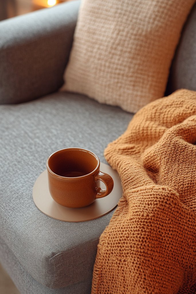
Want to add warmth and richness to your gray decor? Caramel or cinnamon hues create a cozy, inviting environment that feels luxurious. These tones evoke comfort and opulence, perfect for making your space feel rooted and welcoming. Who doesn’t want their home to be a warm retreat?
Visualize a plush caramel velvet armchair paired with a textured cinnamon throw, set against soft gray walls. Incorporate warm-toned wooden furniture or accents to enhance the richness. Think of cinnamon-colored ceramics or woven baskets that add tactile warmth. The combination creates a layered, inviting space perfect for relaxing evenings. Warm lighting emphasizes the cozy, intimate ambiance.
Use caramel or cinnamon tones in textiles, furniture, or decorative objects for a warm, traditional look. During autumn, deepen the shades with rust or burnt orange for seasonal coziness. In modern settings, pair with sleek metals or glass for a contemporary twist. For small spaces, use these hues in accents to add depth without overwhelming. Large furniture pieces or feature walls in these shades make a bold statement.
Start with caramel or cinnamon-colored textiles—cushions, rugs, or curtains—to introduce warmth. Incorporate warm-toned wood furniture or accents to anchor the space. Use textured fabrics like boucle or velvet to add tactile interest. Balance the richness with neutral or gray backgrounds, and add metallic or natural elements. Layering different shades of warm colors creates depth and comfort. Keep lighting warm to enhance the cozy atmosphere.
Add personal touches with embroidered textiles or handcrafted ceramics in warm tones. Mix in different textures—knits, velvets, or wood—to enrich the palette. Incorporate vintage or artisanal decor for a curated, authentic look. Use metallic accents like gold or copper to add sparkle and sophistication. These small details help craft a home that feels both luxurious and personal.
Rich caramel and cinnamon hues transform your gray space into a warm, inviting retreat. They evoke comfort and confidence in your decorating choices. Confidently layer textures and finishes for maximum effect. Your home will radiate warmth, elegance, and a sense of belonging.
13. Pale Gold or Brass for Elegant Metallic Touches
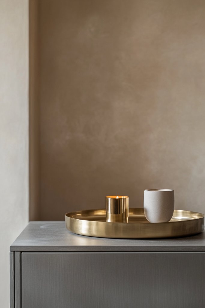
Looking to add a touch of glamour and sophistication? Pale gold or brass accents bring elegance and warmth to your gray decor. These metallic finishes add a subtle glow that elevates any space. Who doesn’t want their home to feel polished and luxe?
Imagine gold or brass light fixtures casting a warm glow over a gray dining table. Think of decorative objects like trays, candleholders, or picture frames in these finishes. Pair with textured textiles and neutral backgrounds to amplify the metallic shine. The interplay of matte, brushed, or polished surfaces adds depth and richness. It’s all about subtle luxury that catches the eye.
Use gold or brass in lighting, hardware, or decorative accessories for a timeless, elegant style. Mix finishes—matte, brushed, or shiny—to add visual interest. During holidays, incorporate gold accents into your decor for a festive touch. In modern or contemporary spaces, these metals add a warm glow that balances cool tones. Small accessories, like knobs or small sculptures, make a big impact.
Start with gold or brass fixtures—lighting, pulls, or decorative objects. Incorporate metallic accessories in trays, bowls, or sculptures. Use a mix of matte and polished finishes for variety, and keep surfaces clean and polished to maintain their glow. Balance metallics with neutral or textured backgrounds—think velvet, linen, or textured wall paint. Layering different metallic finishes adds richness.
Personalize with custom metallic art or handcrafted items in gold or brass. Mix metals for a curated look—pair brass with silver or black finishes for contrast. Incorporate textured textiles or ceramics with metallic details to add visual interest. Use metallic accents strategically to highlight architectural features or focal points. These touches make your space feel intentionally luxurious.
Pale gold and brass accents radiate elegance and confidence, elevating your gray space to a new level. They work well across various styles, from classic to contemporary. Confidently mix finishes and textures to craft a sophisticated, inviting environment. Your home will exude timeless glamour.
14. Monochromatic Shades of Gray for Seamless Sophistication
Want your gray space to look sleek, cohesive, and effortlessly stylish? Monochromatic shades of gray can create a seamless, sophisticated environment. It’s perfect for minimalists or anyone who loves a subtle, layered look. Who wouldn’t want a home that feels both modern and timeless?
Picture a room with varying shades of gray—from charcoal to dove—used in furniture, textiles, and walls. Think of a textured gray rug, a velvet gray sofa, and silk gray curtains layered for depth. Use different finishes—matte, gloss, and textured—to add visual interest. The overall effect is a harmonious, elegant space that’s calming and refined. It’s like a symphony of shades designed to soothe and impress.
Use a monochromatic palette in modern, industrial, or Scandinavian styles. Layer different textures—wool, velvet, linen—to prevent monotony. In small spaces, lighter shades make rooms feel larger, while darker shades create intimacy. Mix glossy, matte, and textured finishes for depth. For a more dramatic look, introduce subtle patterns or geometric designs within the same color family.
Start with a base in a medium gray tone for walls or furniture. Incorporate lighter shades through textiles or small decor items, and darker shades in accent pieces. Use textured fabrics, reflective surfaces, and matte finishes to create depth. Focus on keeping the space uncluttered to enhance the sleek, cohesive look. Play with layering shades in artwork, throws, or cushions to add complexity.
Personalize with textured textiles, sculptural objects, or subtle patterns within the gray palette. Use metallic or glass accents to add sparkle and contrast. Incorporate art or decor with layered shades of gray for visual interest. Mix different finishes to keep the space dynamic and engaging. These details make your monochrome space both sophisticated and personal.
Monochromatic shades of gray offer a refined, seamless aesthetic that’s both versatile and elegant. They foster confidence in your ability to create harmony and depth with subtle variations. Embrace layering, textures, and finishes to craft a space that’s modern and timeless. Your home will radiate understated sophistication.
Conclusion
Exploring these agreeable gray coordinating color ideas opens up a world of design possibilities that can transform your home into a stylish sanctuary. From soothing neutrals to vibrant accents, there’s a perfect combination for every space and personality. Don’t hesitate to experiment and bring your vision to life—your timeless, elegant home awaits!
Leave a Reply